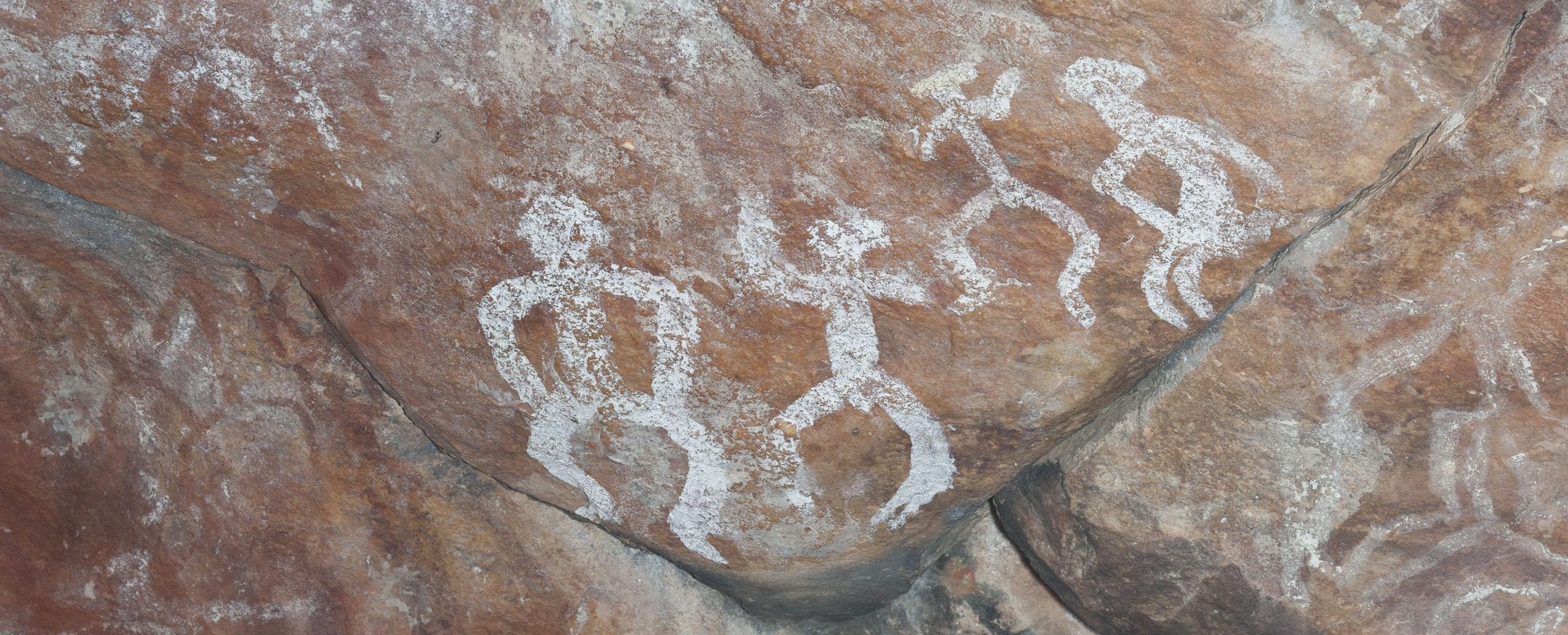
Mayi Kuwayu language.
Mayi Kuwayu in Ngiyampaa (Wongaibon) language means ‘to follow people over time’.
This image shows rock art images of Aboriginal people on Ngiyampaa Country.
Mayi Kuwayu logo.
The Mayi Kuwayu logo was designed by Harley Richards, a Noongar man living and working on Whadjuk Country. Harley is a Freelance Graphic Artist and Painter, and at the time of designing the logo, worked with the Aboriginal Health Council of Western Australia. Harley describes the Mayi Kuwayu logo story as:
The red ochre centre represents wellbeing through connection to country.
The dots represent the non-linear Indigenous concept of time across the communities.
The blue band represents the interlocking connection of culture to wellbeing.
View more of Krystal's artwork at her website www.gillawarraarts.com
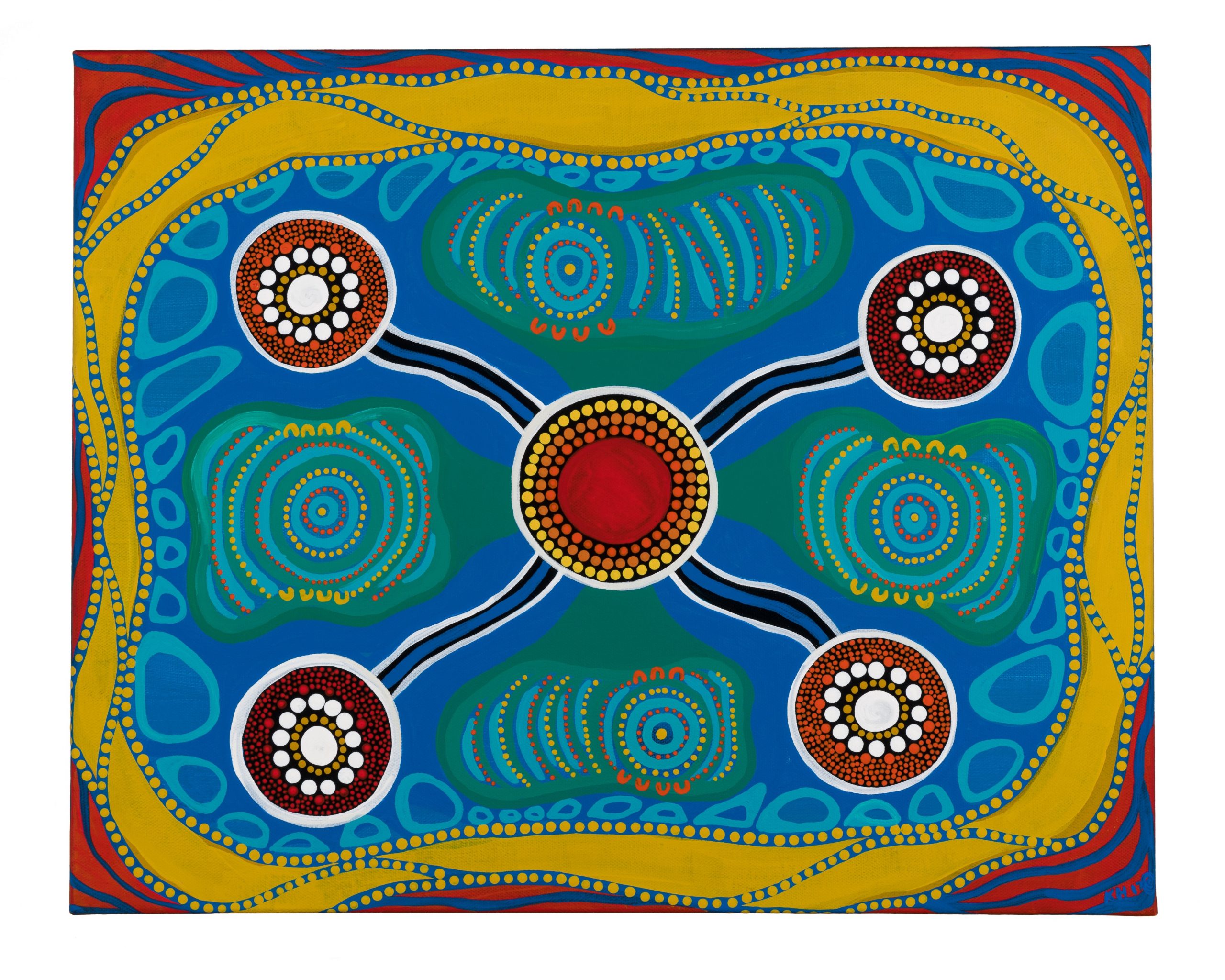
Mayi Kuwayu artwork.
The Mayi Kuwayu artwork shows the importance of culture as central to Aboriginal and Torres Strait Islander peoples’ health and wellbeing. It was created by Krystal Hurst, a Worimi Artist and Creative Director of Gillawarra Arts, originating from Taree on NSW’s mid north coast.
The colours red, yellow, black, green, blue and white are drawn from the Aboriginal and Torres Strait Islander flags, and their communities. The blue represents water and its healing powers to nourish the mind, body, spirit and our lands, symbolic of the interrelationship our people have with Country.
Red, white and yellow ochre are used to illustrate the importance of ceremony, dance, stories and spirituality within our diverse cultures, and the strong connection with the land.
The centre represents the sun radiating warmth, positivity and connectedness. The pathways and meeting places speak of the long journey that the Mayi Kuwayu Study and our mob will embark on together to yarn, make decisions and create a meaningful and positive future.